Role: Product Designer (Individual Contributor)
UX Research | UI Design | Illustrations
UX Research | UI Design | Illustrations
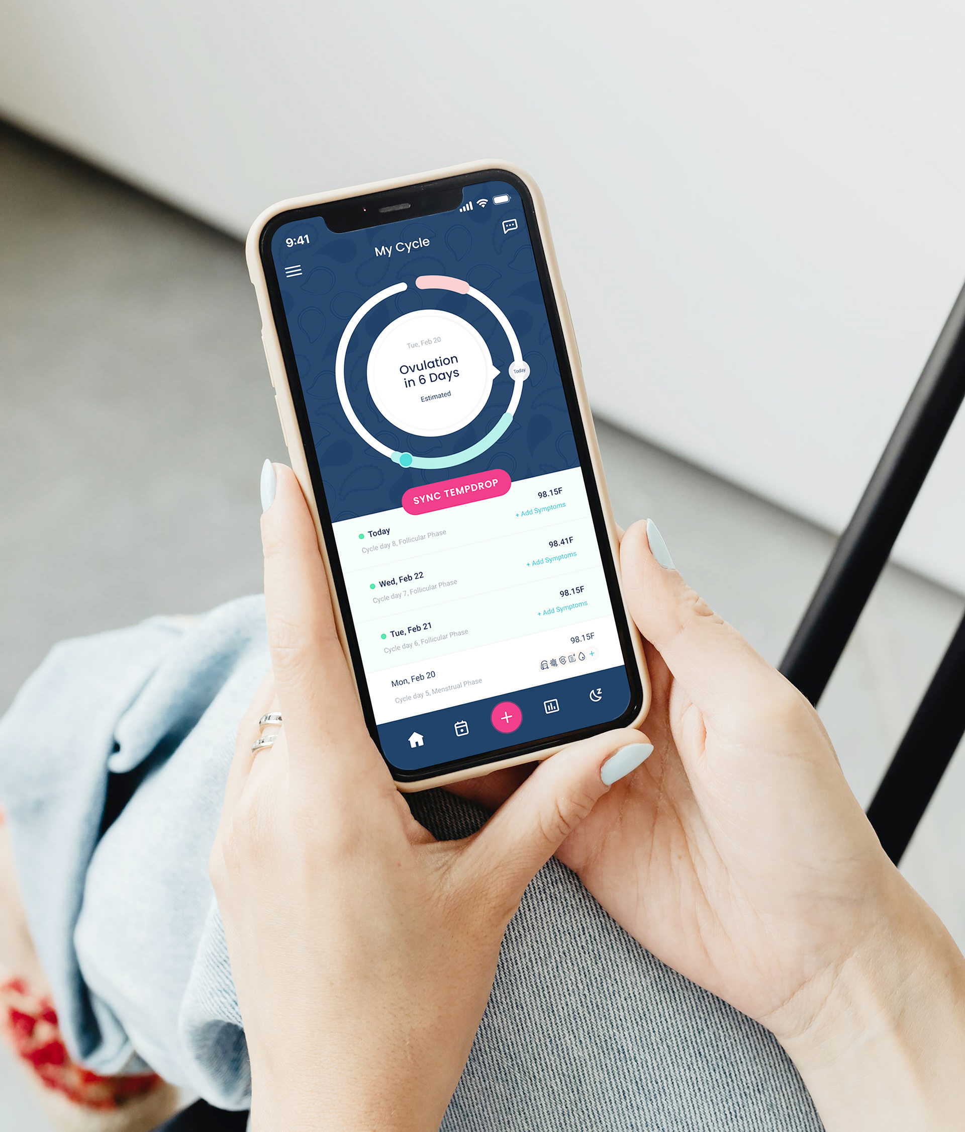
Tempdrop is a fertility tracking app that helps users understand their cycles and work toward their reproductive health goals.
I joined Tempdrop as a Product Design Lead, and this case study presents how we transformed the onboarding experience into a tailored journey for all app users.
Challenge
~
~
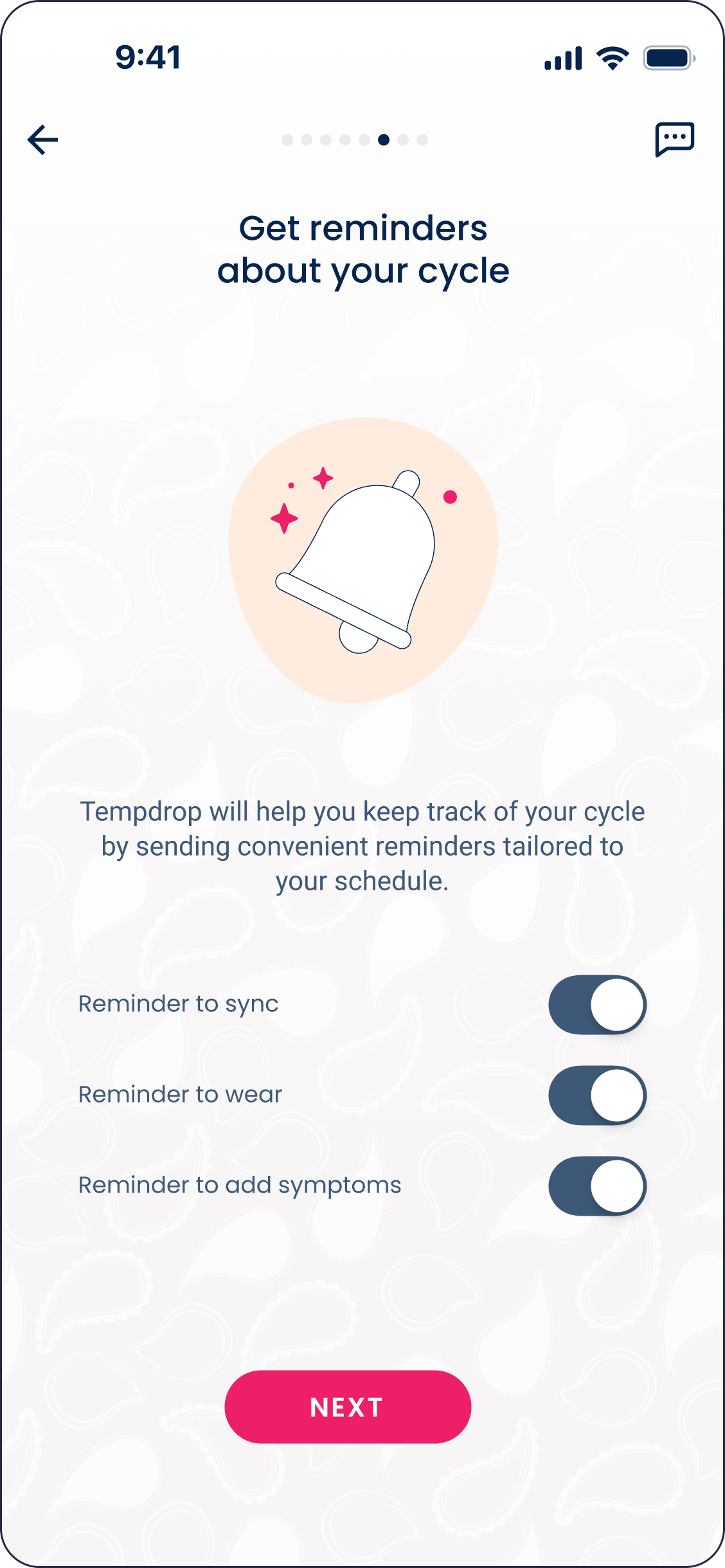
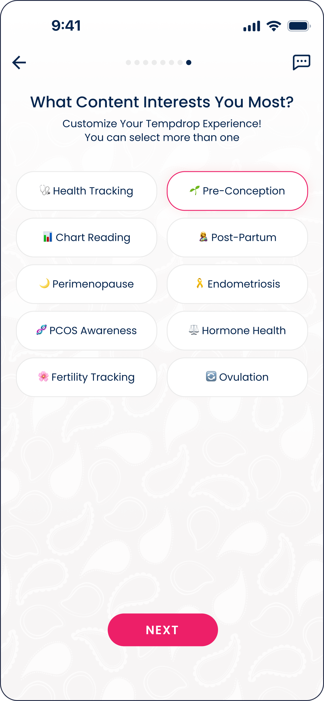
Tempdrop’s onboarding needed to evolve from a uniform flow into a personalized, goal-driven experience.
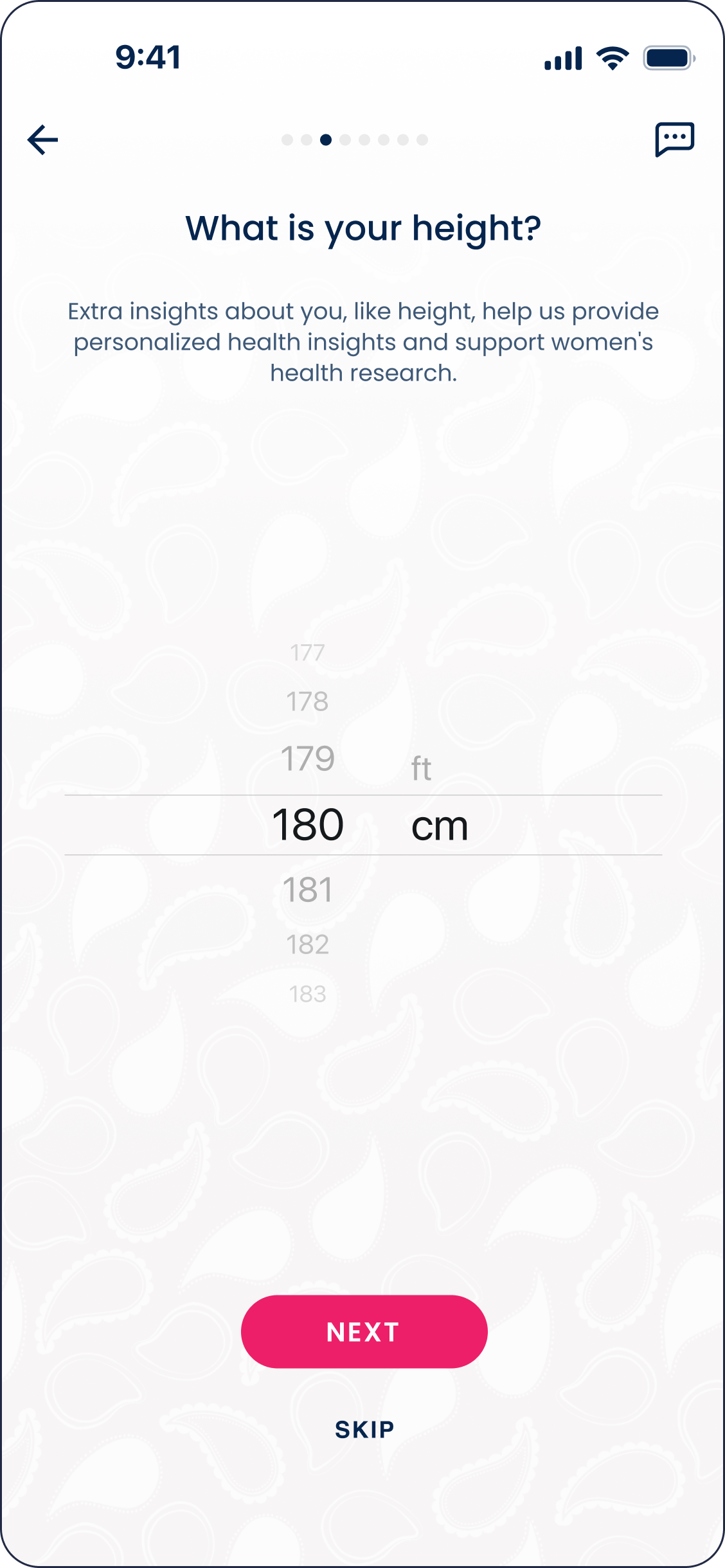
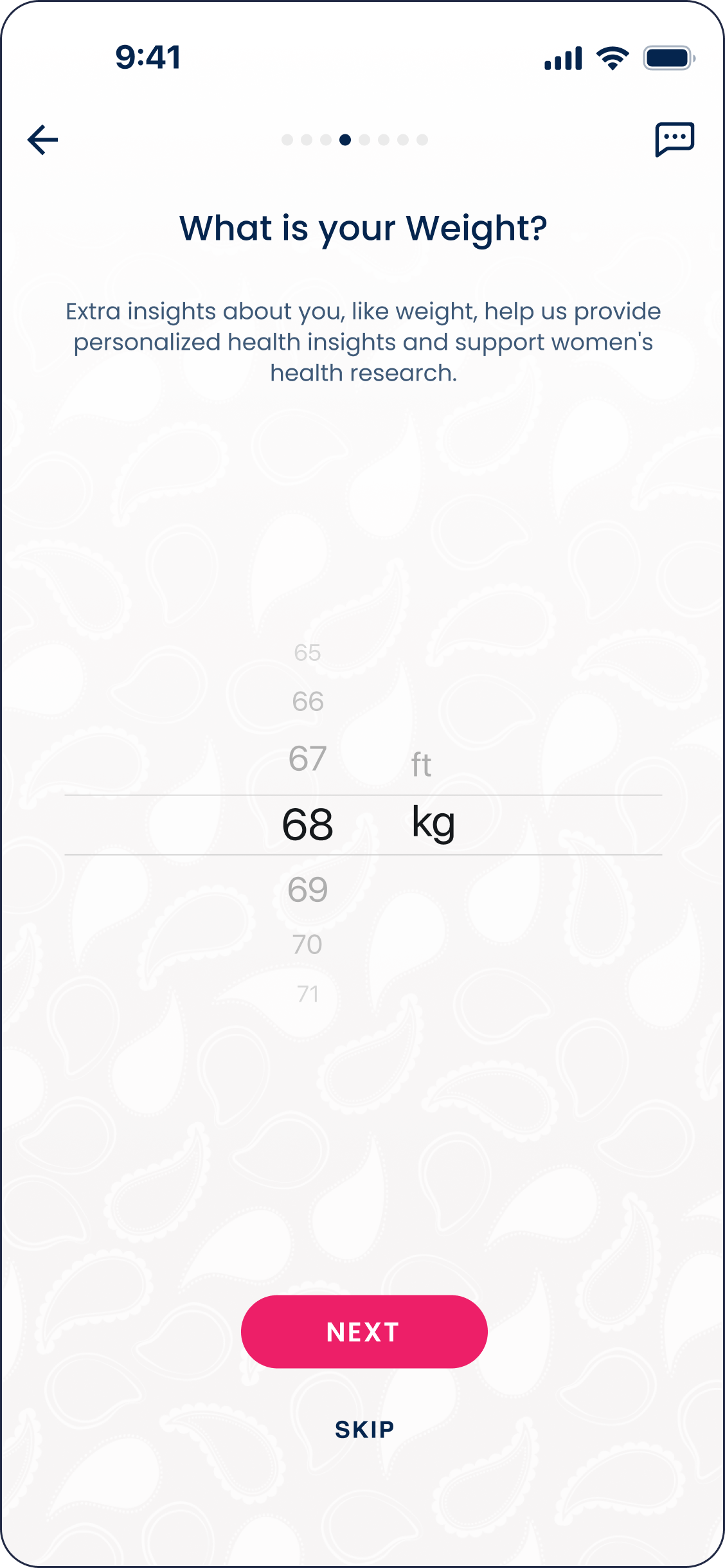
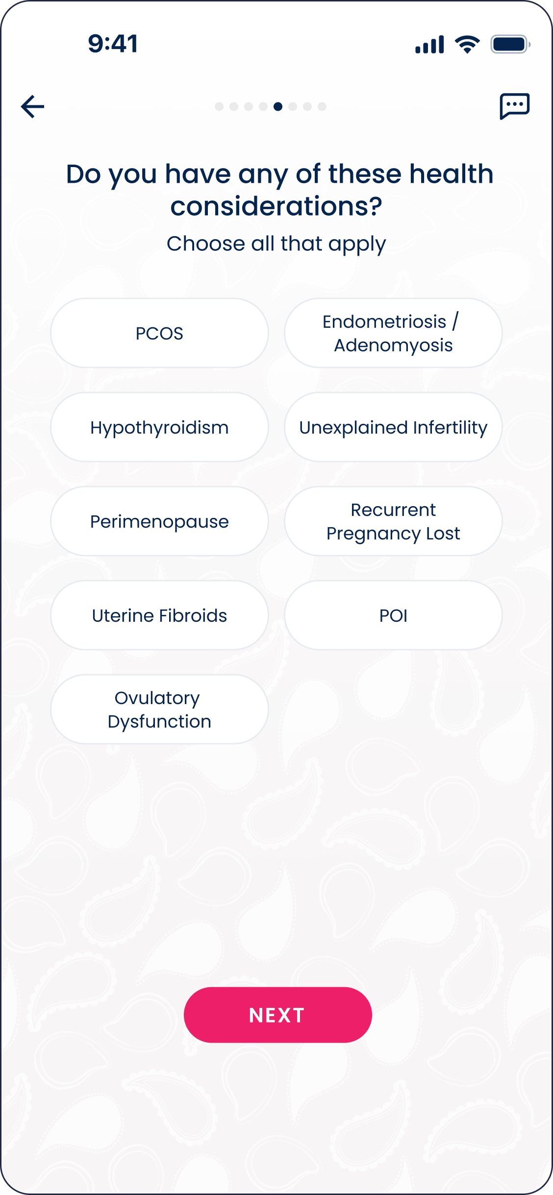
The redesign had to collect structured data to better support the algorithm — without increasing cognitive load — while aligning manual PFA tracking with the system and maintaining user trust.
At the same time, it needed to support new, returning, and inactive users without disrupting established habits.
Research
~
~
To better understand user needs and friction points, questionnaires were distributed both within the app and in the Tempdrop Facebook community.
In total, 312 responses were collected over a two-week period:
187 responses from in-app users
125 responses from the Facebook community
Several consistent patterns emerged:
64% of respondents indicated that onboarding did not fully reflect their specific tracking goals.
72% of PFA users expressed a strong desire to maintain the flexibility and features of the current manual workflow.
These findings revealed a critical tension: users wanted more personalization and system alignment, but PFA users did not want to lose the autonomy and familiarity of their existing experience.
This insight directly shaped the redesign strategy — integrating PFA into the broader ecosystem while preserving its manual flexibility.
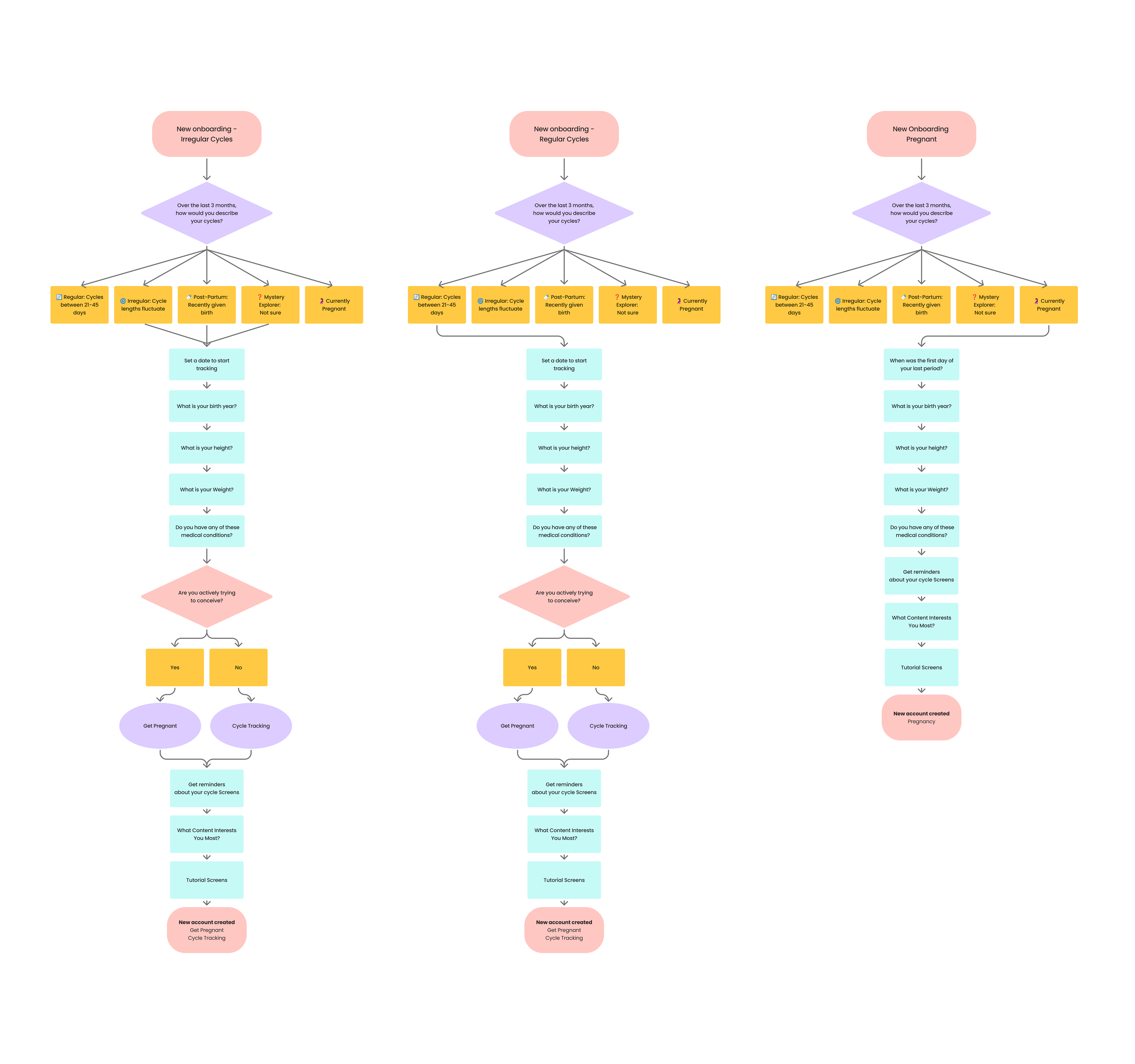
Onboarding Before: How It Used to Work
Design Process
~
~
During the process, I mapped user goals and different scenarios to better understand how women were using the app. This helped clarify the purpose behind each journey and guided how the experience should adapt to support it.
As a result, onboarding was structured to reflect each user’s intention from the start and make better use of the app’s capabilities.
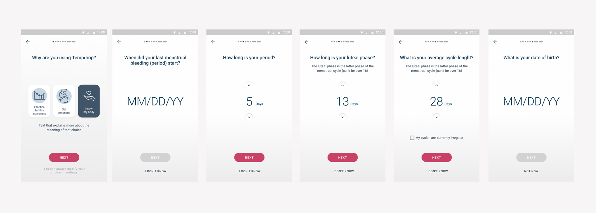
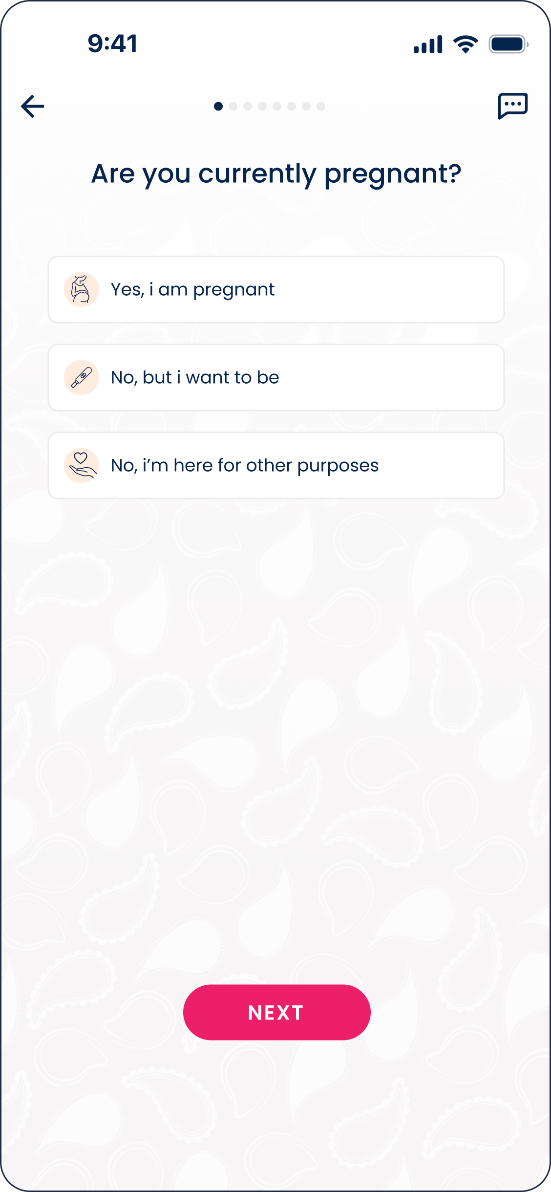
Previously, users had to choose between three predefined purposes of use, including Practice Fertility Awareness (PFA). In the redesigned flow, guided questions help identify the most relevant purpose based on the user’s goals. The app then presents one of three paths — Pregnancy, Get Pregnant, or Fertility Tracking — while still allowing users to switch modes later in the settings.
This approach creates a more personalized starting point while preserving flexibility.
User Journey Mapping
Redesign Impact
~
~
I redesigned the onboarding to create different entry paths based on the user’s context and goals. This allowed the app to collect more accurate information from the beginning and improve how the algorithm supports each user.
The new structure also created a stronger foundation for the product moving forward, making it easier to expand and improve features without creating a fragmented experience.
Together, these changes turned onboarding into more than just a setup process, it became the starting point for a more personalized and cohesive experience.
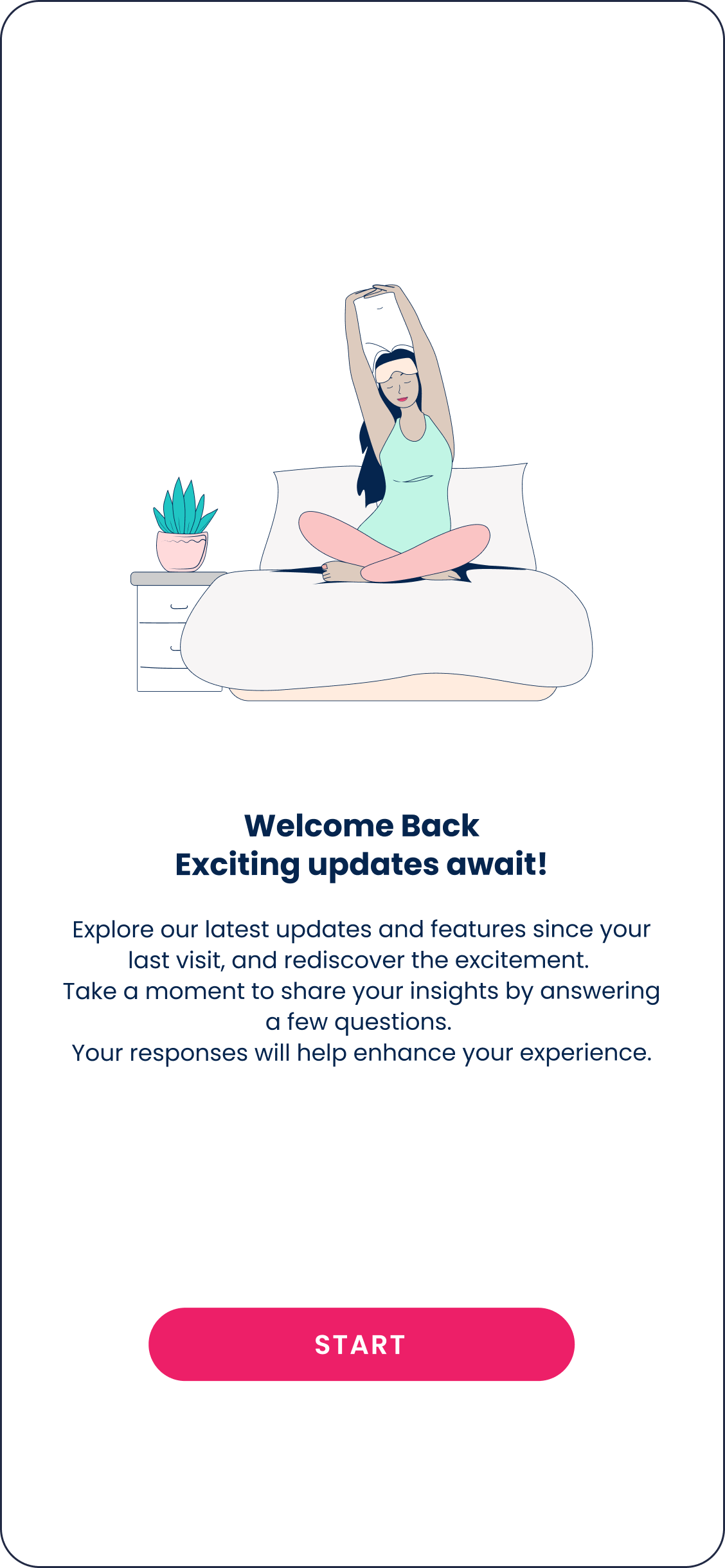
Flow Example: Returning After Long Churn
You’ve completed onboarding. Thanks for reading. ✨